The UN System Staff College was created by a General Assembly resolution in 2002, the only institution in the UN system mandated to build the capacity of personnel and stakeholders system wide. It started small: 1,200 UN staff trained in its first year. Two decades later, UNSSC had become the UN’s premier learning provider, reaching more than 20,000 learners annually across the 2030 Agenda for Sustainable Development, peace and security, and leadership and management.
Growth had outpaced brand. For its 20th anniversary, UNSSC set out to sharpen its identity in service of three goals: stronger partnerships, higher course registrations, and a narrative sharp enough to make the College instantly recognisable, and hard to confuse with comparable institutions.
Understanding a global learning community from the inside out
Co-creation sat at the centre of the assignment. Rather than design in isolation, the team began with a comprehensive brand audit spanning visual and verbal identity, an early diagnostic that revealed where UNSSC’s existing brand was working, and where it was holding the institution back.
Alongside the audit came a benchmarking analysis of comparable institutions across executive education and multilateral training. This produced a clear picture of how UNSSC measured up against peer organisations, and where there was room to stand apart rather than blend in.
Dozens of interviews followed, with UNSSC staff, students, graduates, and partners spanning the UN system, civil society, and government. Affinity mapping across this research surfaced a clear insight: people didn’t value UNSSC for any single area of expertise. They valued it as the place where different knowledge, perspectives, and mandates converged, and became something stronger together than any one part alone.
Working from the research, the team developed detailed personas for UNSSC’s key audiences and used them to shape a brand strategy and a visual identity proposal grounded in how the institution is actually experienced, not just how it describes itself on paper.
That idea, unity built from diversity, became the foundation for everything that followed, down to the shape of the new logo itself.
From insight to identity
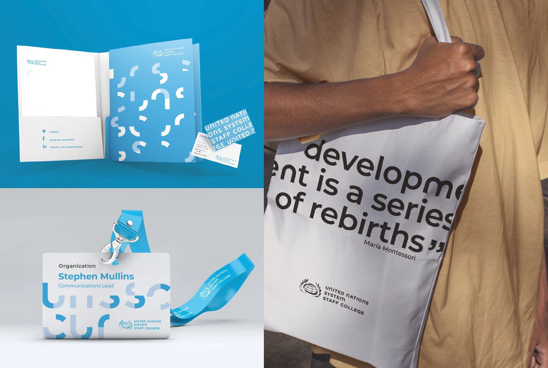
The new logo’s character forms draw on the mathematical symbols for union and intersection, expressing unity and collective purpose, working together as one, and the point where different knowledge converges. The redesign was scoped to the wordmark and typeface. From there, the same logic extended across the full identity system:
- A new logo, colour palette, typography, and visual imagery system.
- A comprehensive brand book documenting UNSSC’s rules for representation across products and channels.
- Corporate merchandising for courses.
- Templates for publications, PowerPoint presentations, video production, etc.
- A curated photo database to support consistent use of the new visual imagery going forward.
Bringing the brand into daily use, in time for the anniversary
Rewire brought the new identity to life across UNSSC’s highest visibility materials, editing the 2021 Annual Report, and shaping the editorial design of the 2022–2023 Course Catalogue. Website content was edited ahead of the site’s relaunch, timed to run alongside the brand rollout so the online experience matched the new look from day one.
A brand built for the next twenty years
The rebrand gave UNSSC a visual and verbal identity that reflects what students, graduates, and partners knew: this is an institution built around people, not just programmes. Timing the new identity to UNSSC’s 20th anniversary turned what could have been a routine refresh into something closer to a renovation, one that honoured two decades of impact while preparing the institution for its next chapter.
***