Strong brands are built on shared purpose. For organisations working across countries and political contexts, a clear brand strategy creates the alignment needed to communicate consistently, build trust and mobilise collective action. We partnered with ARROW to develop the strategic brand foundation for Kaleidoscope, a Global South–led collective strengthening health systems to expand access to safe abortion care.
Building a sexual and reproductive health brand strategy
Through in-depth interviews with consortium partners, we explored how members described Kaleidoscope’s purpose, strengths, ambitions and communication challenges. The research revealed remarkable alignment around shared values while also highlighting the need for messaging that could adapt to different political realities.
These insights became the basis for a comprehensive sexual and reproductive health brand strategy that defined the collective’s mission, positioning, audiences, value proposition, personality, voice and tone.
To ensure Kaleidoscope occupied a distinctive position within the sexual and reproductive health and rights sector, we also conducted a benchmarking exercise that identified opportunities to differentiate its systems-strengthening approach and Global South leadership.
Creating a shared identity across diverse contexts
A key strategic question emerged during the process: how could the collective communicate with one voice without asking partners to abandon their own identities?
We addressed this by developing an endorsed brand architecture that positioned Kaleidoscope as a collective brand while preserving the visibility and credibility of each member organisation. We also created a tiered messaging framework, enabling partners to adapt their communications according to local political contexts while remaining aligned around a common narrative.
This gave the collective something far more valuable than consistent messaging. It provided a shared strategic framework that partners could confidently apply across advocacy, fundraising, government engagement and public communications.
From strategy to identity
Once the strategic foundation was established, we translated it into a complete visual identity.
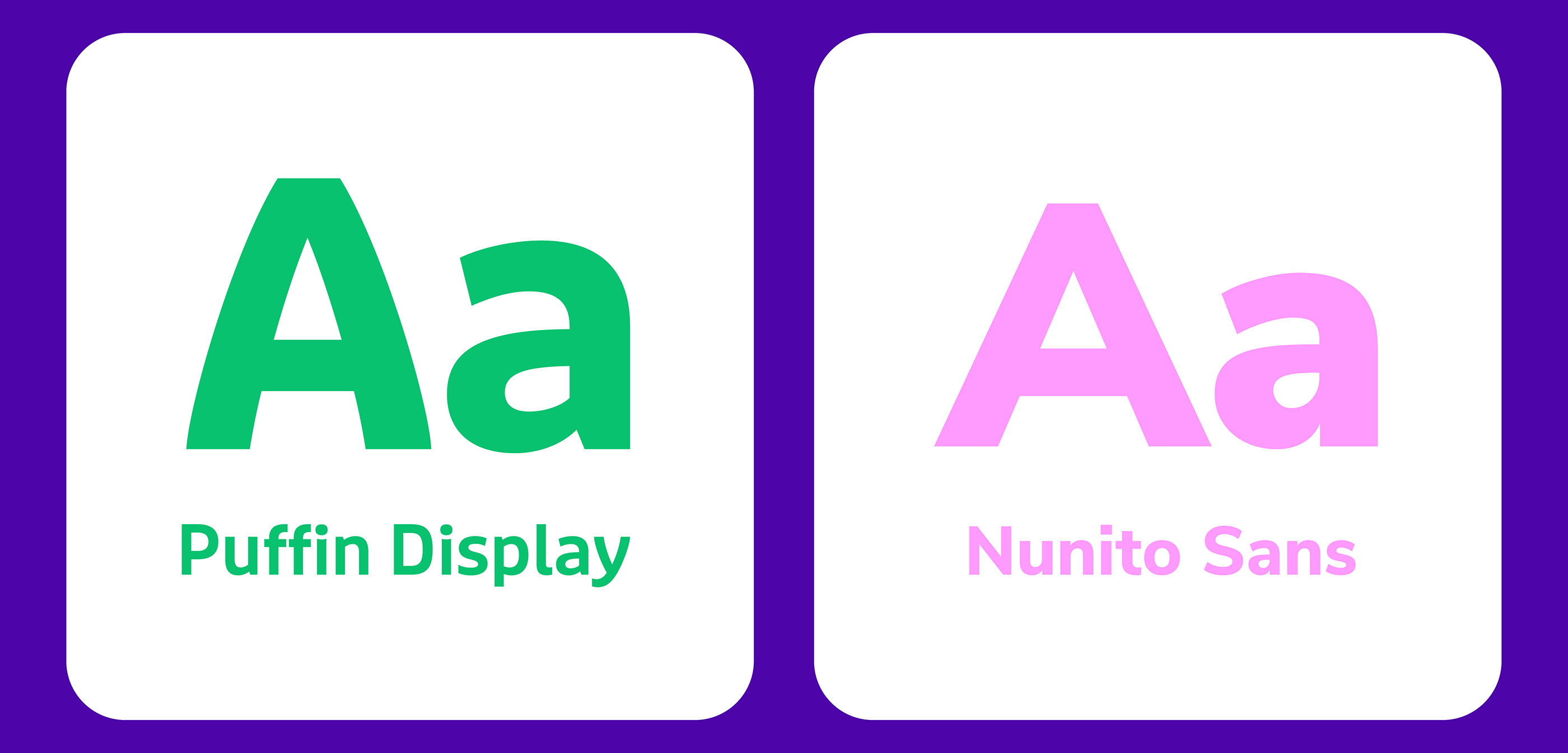
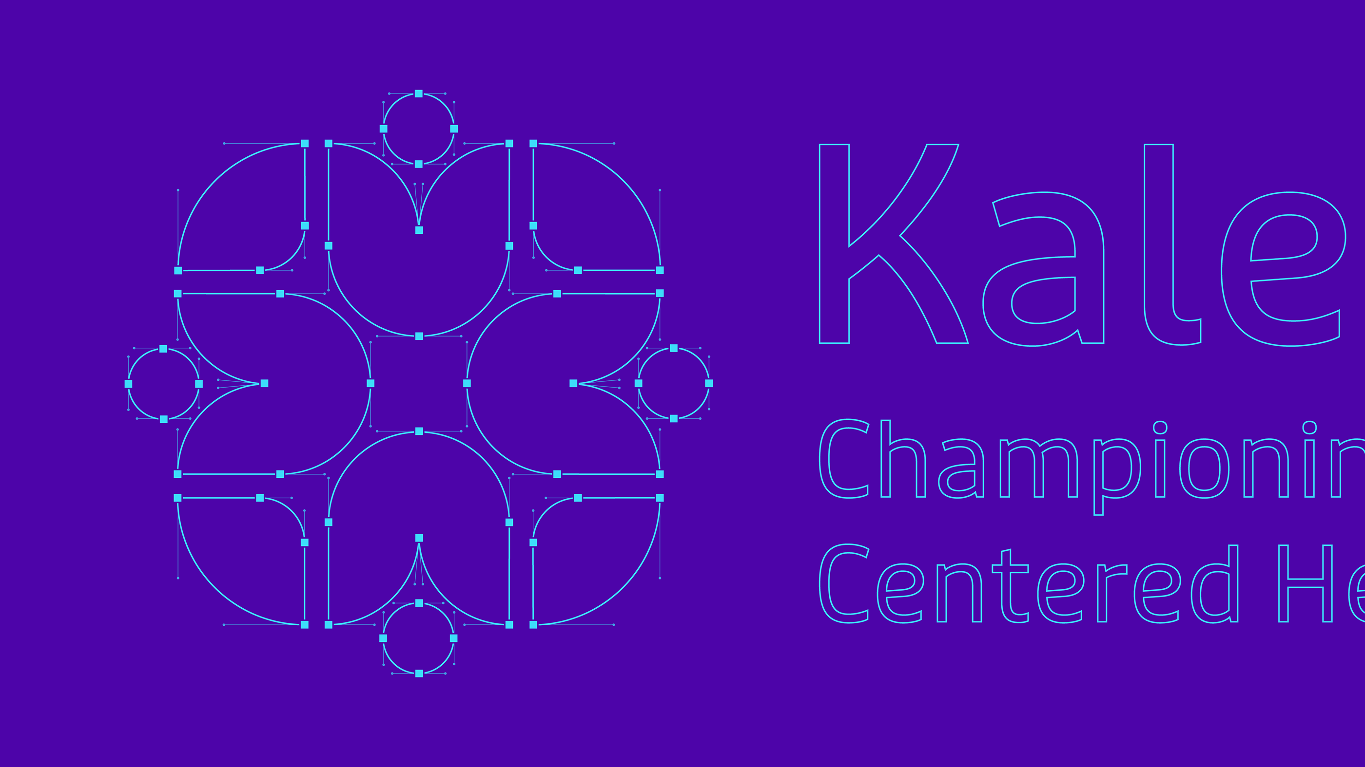
We developed the logo, colour palette, typography, graphic language, photography style and comprehensive brand guidelines, together with practical templates to support consistent communication across digital and print channels. We also designed and developed the collective’s website, translating the brand strategy into a clear and engaging digital experience that communicates Kaleidoscope’s mission, approach and collective identity.
By grounding Kaleidoscope’s identity in research and strategic positioning, we helped create a brand that supports collaboration, strengthens collective advocacy and provides a lasting foundation for future communications.
Bringing the brand to life online
With the brand strategy, narrative and visual identity in place, we helped Kaleidoscope build a website to communicate what the collective is working towards and provide a platform for sharing its work. The site gives the collective a clear home for its goals, partners and country-level work, while creating space to publish news, events, stories and resources as the initiative grows.
We started by developing the information architecture. We then translated the identity into the digital experience, designing and developing the website in English. A French version is now in development.
***