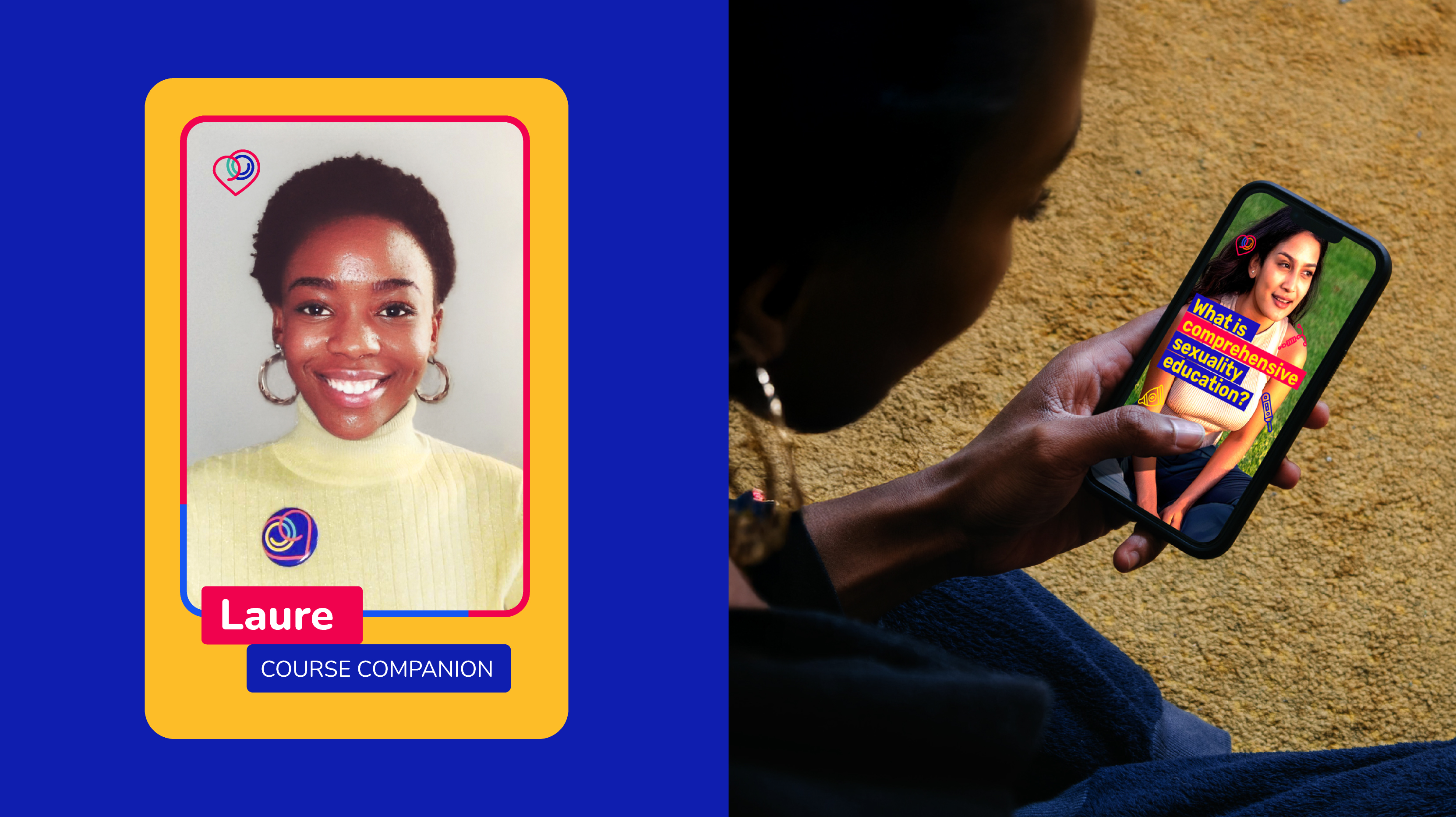
Learning about sexuality requires more than accurate information. It requires environments where young people feel welcomed, respected and encouraged to participate. We partnered with Rutgers International to develop the brand identity for the Comprehensive Sexuality Education Academy. The resulting visual system makes learning more approachable, inclusive and engaging.
Creating a brand that young people can connect with
Comprehensive sexuality education is most effective when young people feel represented by the learning experience. Rather than making assumptions about what would resonate, the Academy’s visual identity was shaped through a participatory design process.
Building on insights from workshops conducted by Rutgers International with young people from different regions of the world, we developed several creative directions for the Academy’s identity. These concepts were then reviewed and refined collaboratively with young participants, whose feedback helped shape the final logo, visual language and overall brand direction.
This participatory approach continued through the development of the Academy’s course identities. Together, we explored different concepts before co-creating a brand architecture with three distinct course logos that reflected the diversity of learning journeys while remaining connected within a single, cohesive system.
At the centre of the identity is a logo combining a spiral of knowledge, a heart and two embracing figures. Together, these elements symbolise learning, care and connection. Rounded geometric forms and the Nunito typeface reinforce a sense of openness, accessibility and approachability, creating a visual identity that reflects the values of the Academy as well as the voices of the young people it was designed to serve.
Designing a consistent learning experience
The identity was conceived as a complete communication system rather than a standalone logo, ensuring learners would encounter the same welcoming and accessible experience at every stage of their journey.
We developed comprehensive brand guidelines covering colour, typography, iconography, illustration, graphic elements, patterns and templates to support consistent communication across digital and print materials. Building on this foundation, we designed more than 50 learning resources, produced the Academy’s course videos, and developed the motion graphics and micro-animations that brought the learning experience to life. We also designed the user interface for the Academy’s learning management system, ensuring the visual identity extended seamlessly across every course and digital touchpoint.
Every element was designed to reduce barriers to engagement, helping learners focus on the content while fostering a welcoming, inclusive environment that encourages participation.
***