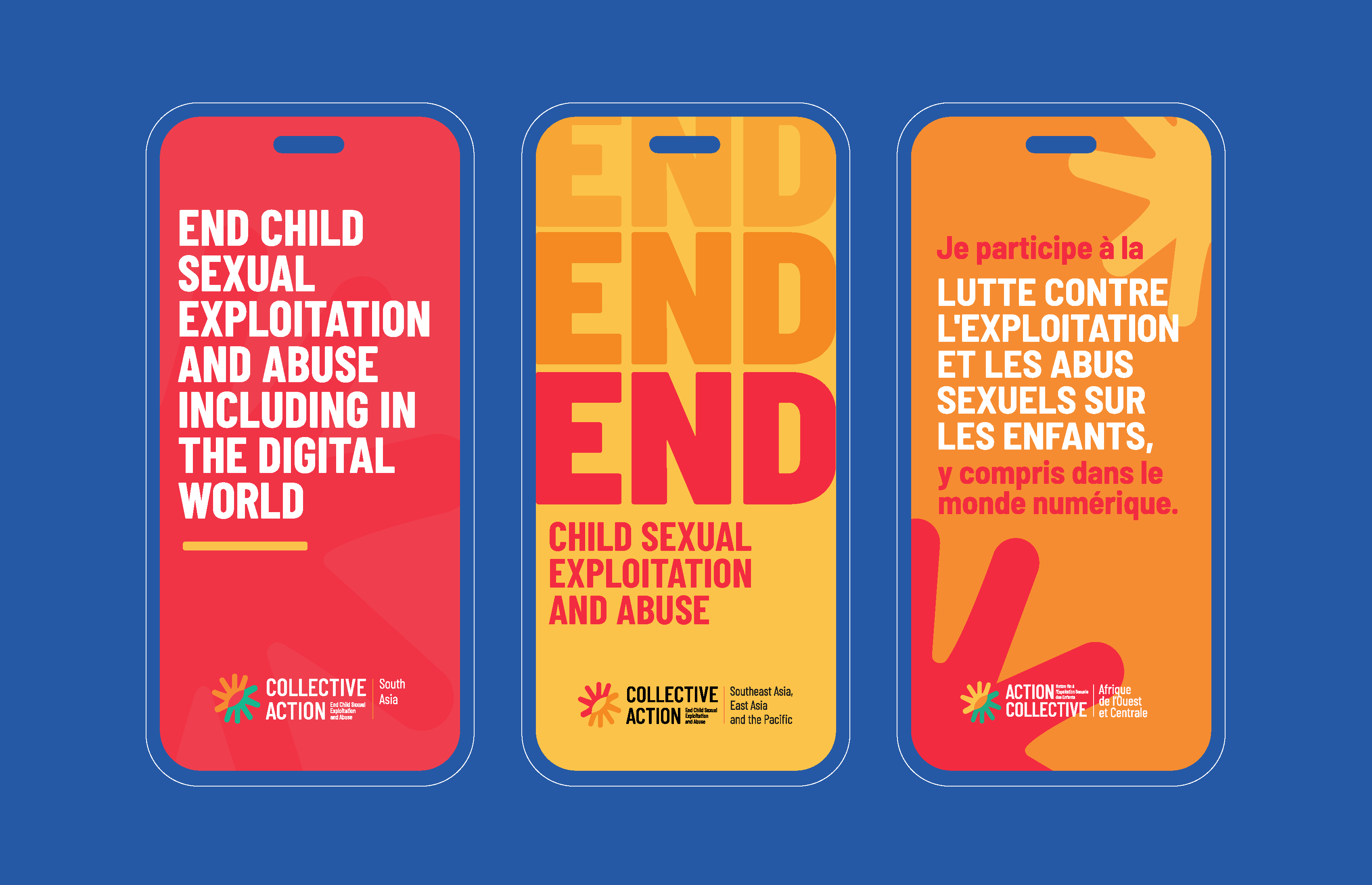
Child sexual exploitation keeps changing shape. Offenders adapt quickly to new technology, children on the move face new risks at every border, and legal systems in many regions still lag behind both. No single organisation or country can answer all of that alone. ECPAT International set up Collective Action to connect regional expertise, strengthen collaboration and build coordinated advocacy around one shared goal: ending sexual exploitation and abuse of children.
The initiative ran a series of regional workshops to examine the realities on the ground, region by region, and turn that insight into coordinated advocacy.
Between March 2024 and February 2025, ECPAT ran workshops in Austria, Costa Rica, Nepal, Senegal, Thailand, and Uzbekistan. Each workshop brought together ECPAT members, civil society organisations, survivor advocates and government partners.
Branding Collective Action – End child sexual exploitation and abuse
Our role was to create the visual identity that would bring this global initiative together. One brand capable of speaking across cultures, languages and regions while remaining instantly recognisable.
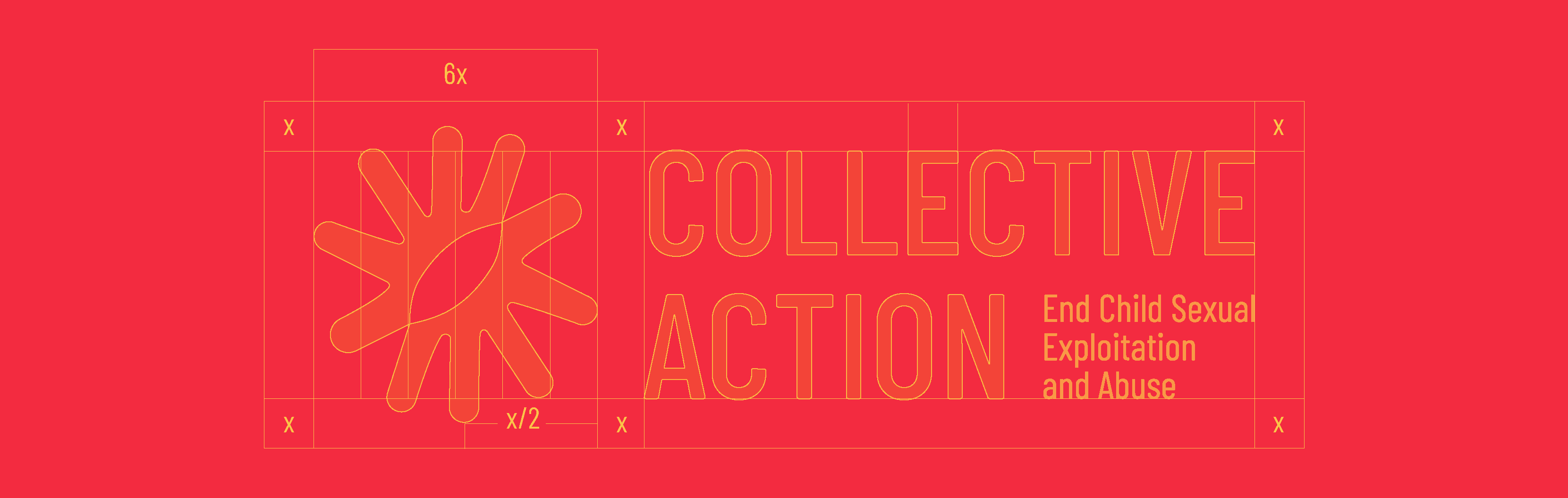
We placed the main goal of the campaign at the heart of the identity: two hands forming the universal gesture for stop. A direct, human call to end the sexual exploitation of children.
Simple and unmistakable, the symbol transcends language and geography while expressing protection, solidarity and collective responsibility. From this central idea, we developed a complete visual identity system that could be applied consistently across every stage of the initiative.
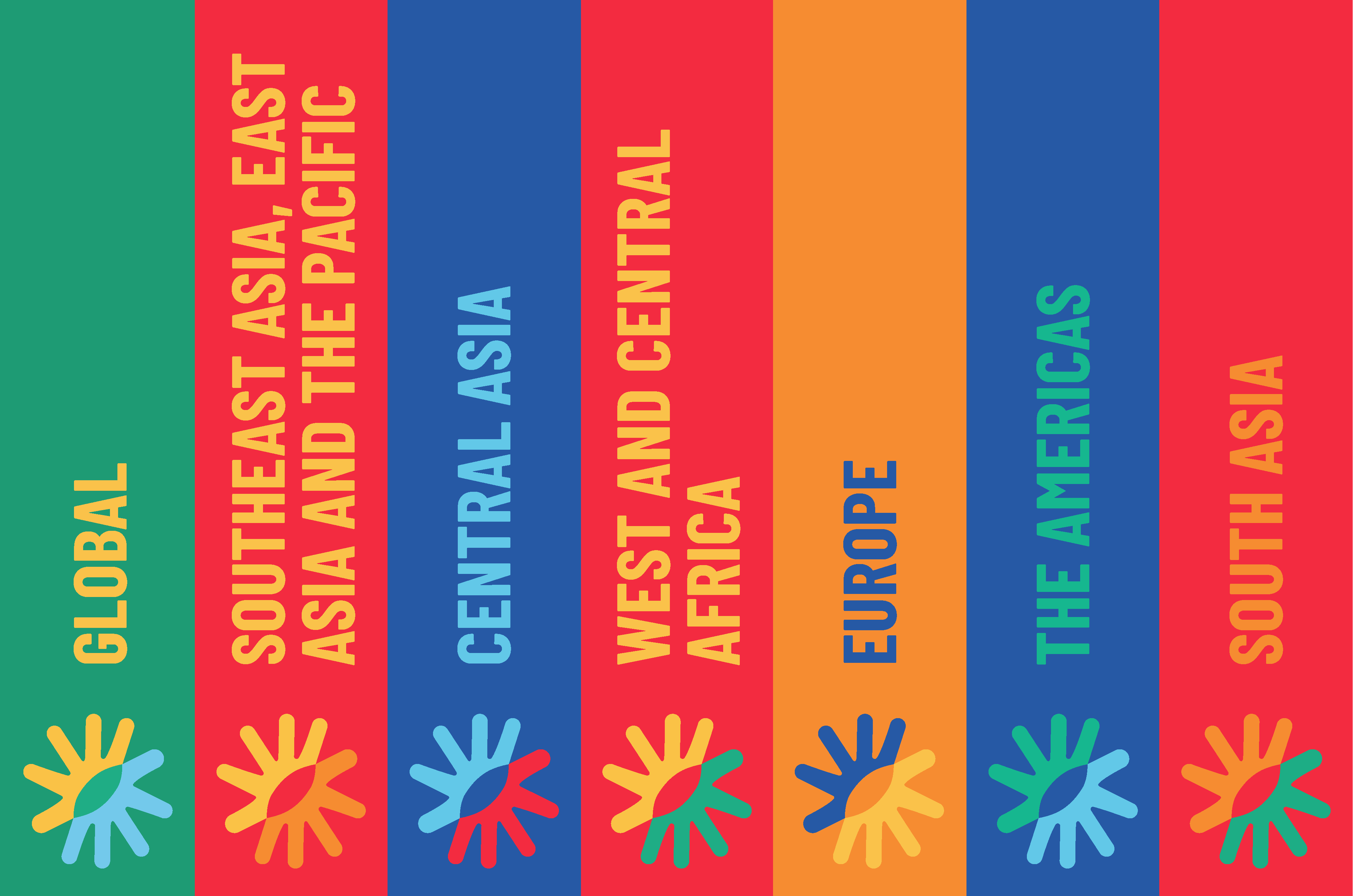
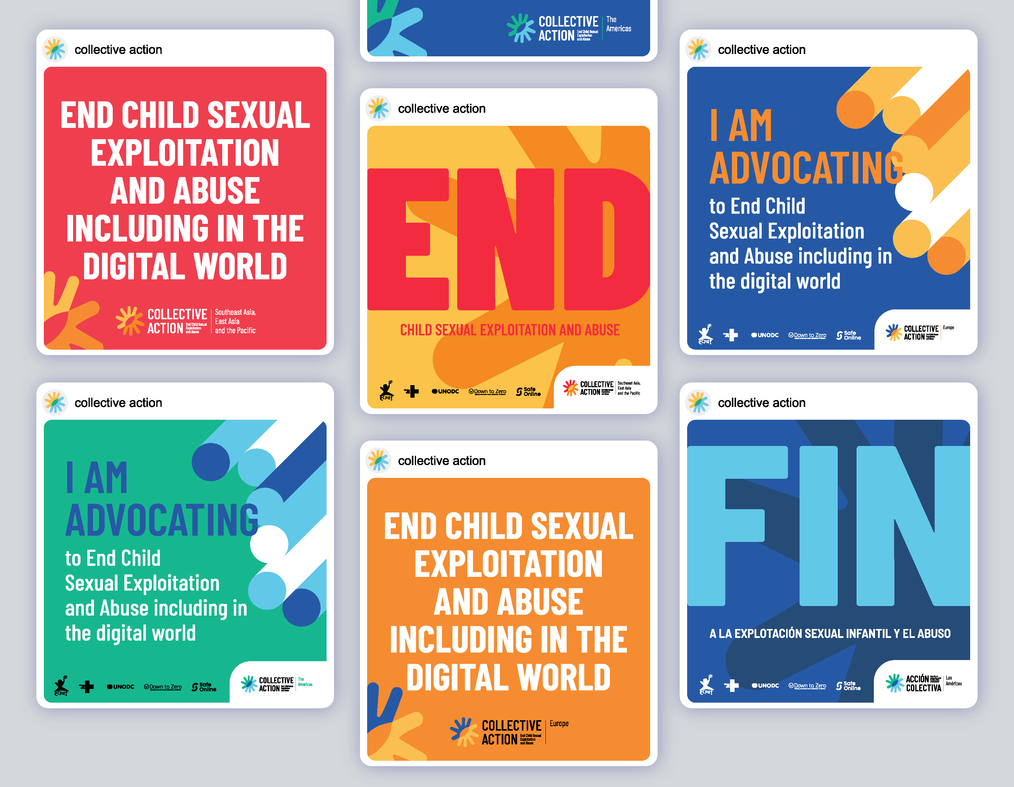
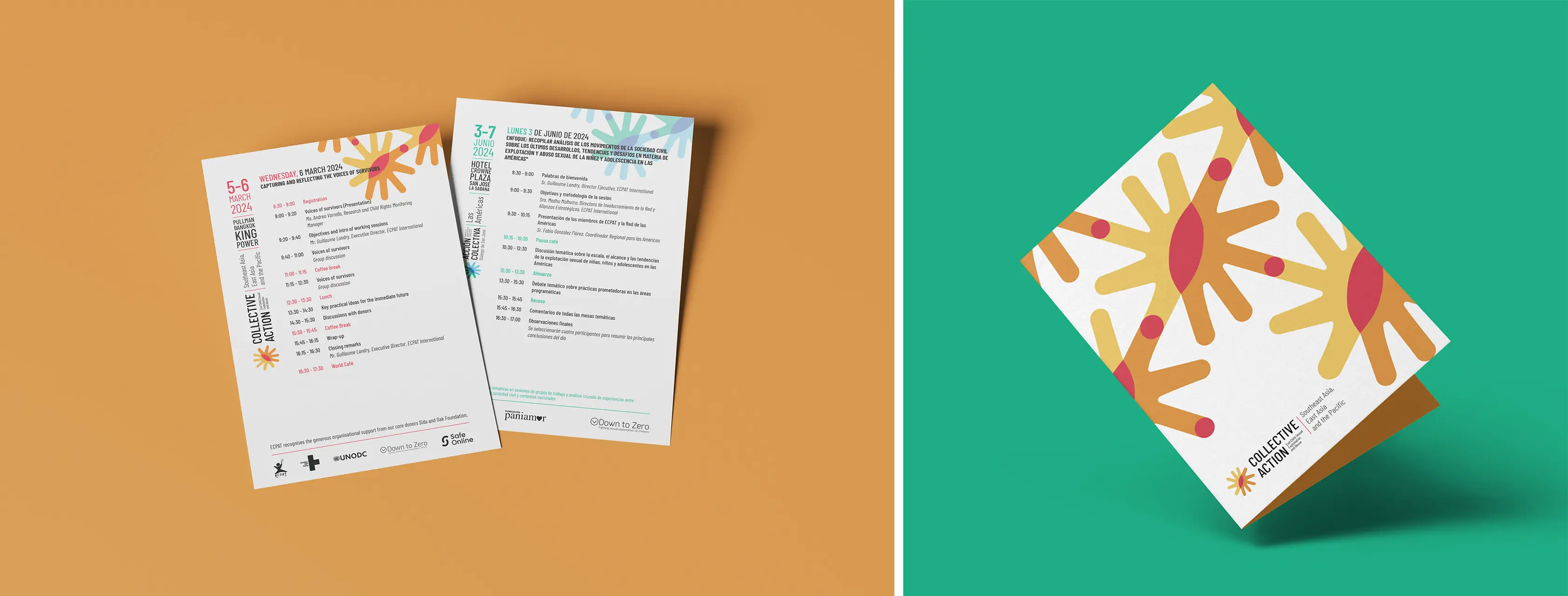
The system included branding for each of the six regional workshops, event materials, printed and digital communications, presentation templates, campaign assets and templates for the design of each regional outcome report.
The result was a coherent visual language that amplified advocacy, strengthened cross-regional collaboration, and gave the initiative a strong, unified voice on the global stage.
***